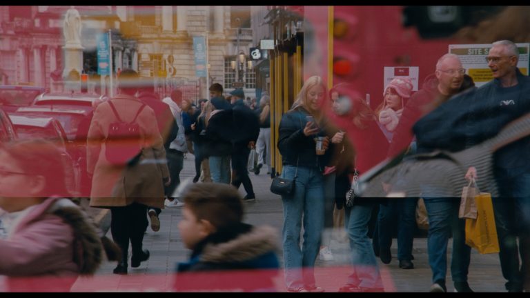
paper visual art journal

Karl Burke, Arrangements, The Hugh Lane Gallery, Dublin 1. November 2012 to February 2013

29.03.2013 (6:56 pm) – Filed under: Reviews ::

Curated by Michael Dempsey.

Karl Burke’s work at The Hugh Lane Gallery, Dublin was part of Into the Light: The Arts Council – 60 Years of Supporting the Arts. There were similar large scale exhibitions in Cork, Limerick and Sligo, where pieces from the collection were shown alongside newly commissioned work from three other emerging / established artists: Mark Clare (The Crawford in Cork), Emmet Kierans (LCGA in Limerick), and Seán Lynch (The Model in Sligo). Also, an extensive catalogue documenting this period of The Arts Council’s history was published to coincide with the opening of these exhibitions.

My focus here is on Karl Burke’s Arrangements in the Hugh Lane, which comprised a series of modular ‘minimalist’ objects arranged in three of the four first floor gallery rooms. His work rested among and framed the other works being shown from the collection. I visited the show a number of times and made sketches and drawings while and after I was there, and took some photos too, not of the work itself, but of things that seemed ‘right’ to photo after viewing the work – despite the photos being merely taken with the camera on my phone. I have decided to put some of these with this text, as they were, in a sense, generated by the work and I see them as belonging to and perhaps even aiding this review / response.

kb1e

kb15e

The first arrangement comprised two, slim, black, 8ft tall, rectangular steel frames about 1:2 in ratio. They stood on their long sides, hinging off from the sides of two of the doorways of the largest gallery room. These frames in plan view would approximately indicate two parallel, diagonal line segments cutting across the room. They framed the other works in the room, they framed space, they framed oneself, they framed time – personal, historical, cultural, etc. One could walk through them and around them, but one could not take both of them in at the same time. Either your eyes had to move over and back, refocussing between each object, or you had to change position in the room, only to find yourself denied there too. Eventually you realised that you could not even apprehend one of these frames at once, in a truly complete sense – you were left with just black line fragments in space.

kb5e

kb14e

kb16e

kb14e

In the second room a small black steel sculpture leaned against the far wall to the right of the doorway that led to the third room. This sculpture was of a seemingly similar material to the rectangular frames in the previous room. It was about 5ft tall and looked like a right hand square bracket. As I walked past it, and through the door frame, and then into the third room, there, leaning against the corresponding wall of this third room, was a reversed version of the square bracket sculpture I had just left behind leaning against the wall in the previous room.

kb3e

Also, to the front of this third room, extending perpendicularly from the top third of the vertical part of the architrave around the window was a white-timber sculpture comprised of three square frames, of equal size (about 4ft square) arranged, like steps, from wall to floor. When you stood back from this piece, the inside faces of these three modular squares (which were painted an impenetrable matte black) started to fling perspective lines and vanishing points out southward and skyward.

kb6e

kb4e

Returning to the second room I stood in a position to the back left of it, where both of the small, black, steel bracket pieces were visible at once. Standing still, and again moving my eyes, refocussing from one to the other, over and back, my experience of time started to collapse into space – a space where an absence was held up.

These things then started to become objects that emerged into this absence, this gap, left behind by language – body language, descriptive, verbal, written language, the visual language of colour, scale, texture, etc.

Within this gap the objects then started to settle somewhere between being separate and having been put apart.

kb13e

kb12e

Coincidences between the sculptural pieces, the building itself, the building’s architectural details, and the other artworks sharing that space and time started to become coordinates of memory – a series of fleeting constructions that gathered elucidations of themselves to a place that was itself unreachable, and that I was unable to draw upon.

kb17e

I then stood at the doorway between the first and second rooms and looked back down through the space that opened up between the two large offset rectangular frames.

kb10e

kb11e

kb9ie

kkbedges of buildingse cropped

Adrian Duncan is a Dublin-based artist, writer and engineer.

Regarding Olympia’s cat: Aesthetic Genetics and the Art Genome Project™

08.02.2013 (11:44 am) – Filed under: Essays / Articles ::

“The unified quality of the thing is not noise at all, but is the sensual object itself…[T]he existence of a unified quality of things means that the sensual realm is already home to a certain ‘I do not know what’ that makes the marble a steady focus of my attention…we do not say je ne sais quoi in a spirit of gentle mockery, but as a true statement about sensual objects.”[1]

I recently joined art.sy. I had read about the site a few months back in Artforum and duly signed up to receive an invite when they were being sent out, forgetting all about it until a few days ago.[2] For those yet to learn about it, art.sy presents a new online facility for the viewing and buying of art. The intriguing thing about the site is not that it heralds a new way of appreciating art, or even interacting with it. The Internet has changed the way the world is apprehended, art notwithstanding: to point this out seems oxymoronic almost. Rather, what interests me is the manner in which the art presented on the site is sorted and categorised, in so doing being inserted into unforeseen contexts and arrangements: that is, by means of what art.sy calls ‘The Art Genome Project™’.[3] This system allows for the categorisation of some fifteen thousand works of art by three thousand artists on the website, according to the application of roughly eight hundred “genes”. Most artworks exist as a melange of some thirty to forty genes. These genes, in art.sy’s estimation, rest on the conceptual, art-historical or formal data that is deduced from the artwork itself, by a team of art historians and other professionals. So, presumably there is a “collage” gene and a “Fauvism” gene; but also, in all likelihood, a “green” or even a “cat” gene.

Screen shot 2013-02-07 at 16.50.45
Screen shot from art.sy in a search for artworks related to “cat”, 07/02/2013; Website: art.sy.com

The categorisation of a work of art can thus be enacted not only by virtue of it belonging to a certain school or era, but also, somewhat arbitrarily, by whether or not a cat resides within the frame. Indeed, on entering the word “cat” into the search box at the top left of the screen and pressing enter, I get forty-one results, which can then be sub-divided into twelve further categories; flatness, primary mark, geometry, contemporary graphic realism, etc. Clicking on “flatness” to get, presumably, some flat pictorial felines, I am faced with a motley crew of six results, Manet’s Olympia sitting in a grid formation alongside works by Romare Bearden and Leland Bell, amongst others. The cat truly does appear as the sole unifying factor here. In this way, art.sy really is the place for collectors with unusually specific tastes: “A contemporary hard-edged colour field painting, predominantly magenta and with dimensions of at least nine by nine? No problem!” And while there are advantages to this specificity of approach, the Art Genome Project™’s system does seem to work hard to break down the actual specificity – better still, singularity – of the individual artwork. The work of art is reduced to a relation – between you, the viewer, your wishes and desires, and furthermore, between the artwork and the sum of other artworks that encroach upon this primary relation. Olympia becomes just one picture with a cat in it, rather than a singular aesthetic representation irreducible to genes. In other words, the ‘in-itself’ becomes the ‘in-itself-as-it-relates-to others’: the artwork becomes a code to be cracked.

Recently I had a conversation with an artist about the prospect of getting her work wrong. A child of post-modernism, prone to harbouring a kind of wistful, Adorno-esque residua modernism, I was quietly delighted to hear her say, yes, you definitely could. Not all readings are correct, she said, the work is not a space for projection; rather, there is a wrong and a right way to read the work, the right way following that of the artist’s intent. Now, I am not quite sure I agree fully with this position, but I do hold a great deal of sympathy towards it. All too often, a viewer or critic (myself included) approaches the work of art with already too much in mind, too many expectations, hopes or desires. Thus the work becomes the place where such tendencies are acted out, a catalyst if you will. The result is that the work of art becomes just one factor in a broad field of relations, its singularity utterly broken. However subscribing totally to the artist’s intent is not possible for me; the truth of the artwork is not reducible to the artist-artwork relation, either. If this were the case, an artwork would be seen once, the artist’s statement read, and the work immediately assimilated; there would be nothing to gain from the second, fifth or twelfth encounter. Going even further than that, arguably the artwork wouldn’t have to be experienced at all: depending on how articulate the artist was, his or her textual or spoken explanation might well be enough.

The question lingered on, and so shortly after the above conversation I asked an artist friend the same question: is it possible to get your work wrong? Her reply was in a manner completely divergent from the first, emphasising the open-endedness of her work, and indeed even welcoming this potential multiplicity of interpretation. But I cannot, after consideration, subscribe fully to this view, either. For me, then, the artwork is shaded by a relation, but does not exist solely as a product of one: something else subsists outside of any relational binary.

Manet: Olympia (detail)
Edouard Manet: Olympia (detail), 1863, oil on canvas, 130.5 cm × 190 cm (51.4 in × 74.8 inches, Collection of Musée d’Orsay, Paris

Art.sy, like the first artist, views the artwork as a puzzle to be solved, a code to be cracked. More than this, both put forward a notion of this code as (a.) solvable, and (b.) stable. Once an artwork has been assigned a specific make-up it remains this way: both artist and website imbue the work with an ‘inner’ intransigence of taxonomy that no person or context can engender. However, art.sy does not share this code; the essential qualities or traits that make up an artwork are pointedly not divulged. The artwork may well change in relation to other contexts and artworks, but the “essential” qualities (to which other things bear a relation to) remain fixed, and secret. The first artist, on the other hand, forcefully articulates and transmits this code, “only this is what it means!” no longer unnamed, yet cordoned off from the dual influence of interpretation and context. And so it appears both positions hijack the artworks’ supposedly essential qualities or ‘in-itself’; the only difference being their respective positions on these qualities’ disclosure or transmission.

Now to the second artist: where is she situated within this horizon? For her, the code is constantly in a state of remodelling or flux, her interpretation of the artwork far from sovereign, even as its creator. If the work of art’s essential quality is sketched at all, it is as aporia: interminably slipping from comprehensive understanding, it eludes even its creator’s grasp. In such a way, even the denial of an ‘in-itself’ permits a fetishisation, albeit of a relation. Although the work exists ‘in-itself’, it appears as though this is constantly being altered and remade as it pertains to a relation, not only the ‘artist-artwork’ relation but also the ‘artist-artwork-receiver’ (critic/viewer) triad. This positioning, although diametrically opposed to that of the first artist, paradoxically holds much in common with that of art.sy, also. Both share a ‘correlationist’ perspective of the work of art, in that the work of art’s essential quality is fundamentally that of a relation (between the viewer and the artwork; between the artwork and others on the computer screen, etc.). The ‘in-itself’ of the work of art, if there is one, is a product of this relation; it is neither fixed nor essential, but constantly in flux, a product of overlapping entities and contexts.

This viewpoint, of course, will be a familiar one to anyone with even a passing interest in contemporary philosophical thought, particularly that of French philosopher Quentin Meillassoux, and the speculative realism school more broadly.[4] Meillassoux’s Après la finitude [5] (2006) acts as a riposte to the legacy of phenomenology, which Meillassoux predominantly blames for the contemporary dominance of what he terms ‘correlationist’ thought. This mode of thinking emphasises the pre-eminence of the subject-object correlation, and as such negates the possibility of the ‘in-itself’ of any object. Contra this position, Meillassoux and speculative realism broadly put forward the notion of an ‘in-itself’ independent of the subject-object relation; that is, indifferent to language, consciousness, etc. This Meillassoux does by using the example of the ancestral fossil (‘arche-fossil’): dating from a time anterior to human ‘givenness’, this fossil proves an irrefutable challenge to the correlationist: how can she think of this object as existing only by virtue of a relation, even though it exists as remnant of an era prior to all (human) relatedness? This object, in short, has qualities that subsist – and indeed have done so – outside of the subject-object correlation. These qualities, for all intents and purposes, are actually indifferent to that relation.

Meillassoux argues that such properties are those given only by mathematics, which alone can be thought in absolute terms by being able to function outside the remit of human relatedness. Thus speculative realism in effect absolutises mathematics, for it alone remains unaltered (and humanly unalterable) in the absence of human givenness. Which, in a strange roundabout way, brings me back to art.sy. Through its idiosyncratic classification, the artwork is reduced to a code: more than that, a secret, absolute code – one that remains intransigently static irrespective of context.[6] However, art.sy’s is an absolutely correlationist code, born only of an impartial and finite human relation. What art.sy effectively achieves is the formulation of a pseudo mathematics, the illusion of infinity where there are only the short-term gains of economy and reputation. After all, who are the individuals responsible for the assignation of genes? Where do their allegiances lie if not with profit?[7] Tangentially, and taking a wild example: say the cat population of the world becomes infected with a deadly and wholly unaesthetic virus, the net result being a universal and irrevocable aversion to felines. In every other regard, remarkably enough, the world is virtually unchanged. Now, would the value of imbuing a work of art with a “cat” gene be a constructive thing to do in such a scenario, hypothetical though it is? No it would not: no one would want to look at, let alone buy, a depiction of a cat, and so the feline gene would become inevitably debased. Similarly, in the wake of 9/11 any depiction of a skyscraper would necessarily suggest a plane crashing into it – that would have been a morbid, but wholly natural, thought progression. Now with this any depiction of shiny metropolis, skyscrapers gleaming in the sunlight, would have been unsavourable to the point of insensitivity; in short, the ‘skyscraper’ gene would slip drastically down the scale of desirable genes, most likely dragging other related ones down with it. Thus two structural hierarchies of genes exist with regard to art.sy’s system; one that makes artworks less or more desirable by virtue of their most defining genes; and another, which pertains to the genes’ specific arrangement within a certain artwork, which is dependent on how relevant each one is with regard to it. Both hierarchies are neither stable nor neutral, but instead always in a kind of relationary flux: imagining a stock exchange of genes comes close.

Egan
Aleana Egan: Room after room (2012), Steel 170 x 140 x 2cm; Image held here.

This may all seem a bit obvious, like it almost doesn’t need to be said. For me though, the art.sy conundrum neatly articulates a paradoxical desire accompanying any consideration of the art object: a petulantly divergent two-pronged desire, that is, furthermore, absolutely crucial. Two incompatible breeds of expectation are at work here, the art object thus becoming the site of a virtual tug of war. For the thought of art.sy being an apt vehicle for the systematic treatment of art remains an aberration; “‘Olympia’ cannot be reduced to a configuration of so-called genes!” Indeed there is a real vehemence present when the art object is couched in such reductively comprehensive terms. But curiously this intensity can also be matched when art is described by virtue of its ineffability or elusiveness: “For Christ’s sake, it’s just a painting – a configuration of line and shape in pigment on canvas – with a cat in it!” This dual nature is why the thought of speculative realism heralds not only a kind of ecstatic, nihilistic freedom (from relativism, from anthropocentrism, etc.), but also a kind of ontological dread: the object is indifferent to me; to language, and human mastery: that a certain something else simply doesn’t need me. This applies to all objects; dead, inert and separate, not only those described as ‘art’. A Moebius strip in-itself, the object forbears any attempt to exhaustively subdue it. For if I had full mastery over it, it would no longer fascinate; at the same time, if the potential of mastery was not present, neither would it hold me there. In it there must be present a promise, but one whose deferral is neither relational nor symbolic, but structural.

In conclusion, I wish to say that I had previously considered writing another essay, much different from this one. That essay would have served as a guide to the one you read now, if it had been written, and it may be yet. Using the form of a paragraph, the essay would comprise perhaps five or six of these condensed essay forms, and each would deal with the same work of art; the intention being to practically elucidate questions begged by speculative realism and, in a different way, art.sy. Both appear to take up the artwork’s challenge, or at least attempt some semblance of a re-evaluation. But to spend time with the work or art is always a question of its continued re-evaluation. Truly engaged consideration inevitably enters the same endgame as speculative realism, whilst at the same time negating any claims made by art.sy as to the essential, intransigent – but ultimately graspable – properties of the work of art. The work of art I was to write about is by Aleana Egan, that recently rested, slender and calm, on the walls of the Douglas Hyde Gallery.[8] Its title is Room after room, and it has stayed with me, somewhat inexplicably, from the first time I saw it.[9] It is complete in that it dictates nothing: about it, or me, or how that relation should be performed. It provides the open place for a thought, but a thought that attempts to think it through materially, as an object. For although it means something, the artist’s intent being most likely the strongest guide for figuring that out, even that is not enough: “I hear you say what it means, but…” This openness of the work is that of an ill-defined promise, but a promise that always remains a promise of something. And though the artwork’s promise might be deferred, necessarily and structurally, its fulfillment is always tangible, necessarily and structurally, too.


Rebecca O’Dwyer is a writer and researcher currently based in Dublin.  She holds a BA Fine Art Sculpture (2008) and MA Art in the Contemporary World (2010), both from NCAD, Dublin.  In 2012 she commenced a doctorial research at NCAD, focusing on the figure of transcendentalism in contemporary art.


* This essay was originally published in Paper Visual Art Journal’s Limerick hard copy edition last August. We will be shortly making the PDF of the hard copy available on the site.

______________

[1] Graham Harman (2007) On Vicarious Causation in Collapse Vol. II Speculative Realism. London: Urbanomic, pg. 214

[2] The article where I first learned about the project was Michael Sanchez Pandora’s Black Box, Artforum, March 2012. Available at: http://www.artforum.com/inprint/id=30331 (Accessed June 2012)

[3] Presumably, that ™ is there to supplement the system with even more gravitas.

[4] Speculative realism takes its name from a conference held at Goldsmiths College, London in April 2007. The conference featured presentations by Ray Brassier, Iain Hamilton Grant, Graham Harman, and Quentin Meillassoux, and was chaired by Alberto Toscano.

[5] This then appeared in English translation as After Finitude (2008), trans. Ray Brassier (London: Continuum)

[6] The choice of the word gene, also, is very interesting. For me there is a kind of odd religiosity present in the equivalence between the biological and the aesthetic domain. The artwork, like the person, is formed and bound by this configuration of genes, but the primary aesthetician/biologist remains absolutely out of the frame.

[7] Although art.sy claims pedagogy as a crucial motivation of the venture, a quick look at some of its main investors makes it difficult not be cynical: they include Dasha Zhukova, founder of Moscow’s Garage Center for Contemporary Culture; Wendi Murdoch, film producer; Peter Thiel, founder of Paypal, board of Facebook; Josh Kushner, managing partner of Thrive Capital; and Jack Dorsey, creator of Twitter.

[8] Egan’s solo exhibition day wears at the Douglas Hyde Gallery ran from June 1 – July 18, 2012.

[9] Room after room (2012), Steel 170 x 140 x 2cm.  An image of the work available here: http://www.marymarygallery.co.uk/index.php/gallery/category/C2/aleana_egan/P3/ (Accessed: 4 July, 2012)

-

Compassion in art criticism

29.01.2013 (12:21 pm) – Filed under: Essays / Articles ::

The empty corralling of theory and over-use of jargon that pervades an increasingly marginalised visual art discourse in Ireland is affiliative to the point of being conservative and unwelcoming. This manifests itself in the over-usage of lifeless words that operate sluggishly in the vague but precise-sounding recesses of an increasingly sciencified system of art discourse, and art/art theory education. The words that occupy these rarefied recesses lack amplitude. It is the amplitude of the range of their meaning that give words their life.

In this short essay, my intention is to consider what compassion can do to art criticism, and by extension how visual art might be written about. Here, by compassion I do not mean solely that one recognises the Other and treats this other in a sympathetic way, forgiving all faults and excesses. I mean to take this instinct and consider it in another way. Humane, complex, and relevant criticism in art comes from a place of compassion that is fundamental, and it opens up a number of further levels of interaction between artwork, artist, writer, and reading public.

Image Credit: Tony
Photo: Tony Compagno (2011)

Compassion in art criticism stems from a rigorous interaction with the artwork or artist you are engaging with – almost to the extent that your life depends on it. This sort of engagement creates a place whereby the critic honestly applies the same intensity of critical engagement to him or herself as he or she has done to the artist/artwork being engaged with. This creates an ever-deepening cycle of questioning and self-questioning, appraisal and self-appraisal, judgement and self-judgement. This instinct and private gesture of shared doubt and appraisal happens as one engages with and writes about the artist/artwork, and after these activities. This also goes toward changing the nature of the gaps between the public gesture of an artwork and the forming of an opinion about the artwork, this opinion being expressed publicly, and in turn the relationship with the reader of this opinion. This cycle of questioning reduces the chances of a critic being dismissive and/or negative – and I mean negative in three senses here: not just an absence of encouragement, or the lack of anything offered in place of a denigration, but also by only recognising as innovative something they recognise for already having once been innovative. From this we get the application of ‘taste’ to artworks, a situation whereby artworks can almost never affect the critic’s taste.

The sort of compassion that I am talking about here creates a situation in the critic’s practice whereby it is as important, or dangerous, to say something critically positive as it is to say something critically negative. The intention is not to create a stultified form of criticism, but quite the opposite. By the critic being as critical of him or herself as he or she is of the artwork or artist being appraised, there emerges a cyclical, fluid sympathy in their thinking, judging, and writing. It involves a measure of the writer’s ability to judge in sympathy with a measure of the artwork being judged. The writer becomes immersed in, and writes from the situation of the artwork, thus offering a history-from-below of it, which over time will contribute to its official history.

When relaying one’s opinion of an artwork, this cycle of judgement and self-judgement should be allowed to extend from what you say into why you say it, and how you say it, i.e. is the language you employ to talk about the artist/artwork compassionate? This engagement with language is done on at least two levels: one, through a meaning you hope to communicate and, two, through the nature of the words you use to relay this potential meaning. Writing about art can be done from the simple to the complex, at word, sentence, paragraph, published text, and oeuvre levels. If you wish to be understood you are writing to the reader’s curiosity. If you feel you ought to be understood, you are writing to the reader’s education. These two situations create different uses of language. I think when one is writing about art, one should be aware of these situations, and question one’s interaction with them.

*

People external to the discourse of art can contribute to the discourse in a meaningful way, thus widening and deepening it, and making it still more complex. It is within this complex, unstable, and growing tissue of art discourse that people can navigate based upon appeals to their curiosity, not solely to their education and tastes. Writing about visual art and discussion about visual art can be done using a language and style sympathetic and invitational to those people who do not discuss or think about visual art on a regular basis, thus making a gesture outward from the discourse, while still not doing a disservice to the complexity of the artwork being discussed. The extraordinary difficulty inherent in attempting this is the responsibility, now, of those within the discourse of art, i.e. the artist, the art-writer, the critic, the editor, the curator, the educator, the student, etc. This should be an ambition in their practices. The belief in and the use of the astounding instability of words is where this effort can begin. A reader, any reader, should be invited to lie on one’s back upon the possibility of a sentence all the while facing outward at a universe of multiplicities suggested by it.

*

Creating writing and discussion about art in a way that is compassionate will change the manner with which the ideas in it are communicated too. Quantitatively less might be said, but I believe the language that stems from this shift in emphasis will also force the writer/the thinker about art to say something new, and ask new questions that stem not from fear of a need to legitimate the asking of the question. Writing here will cease to be an exercise in the dressing of the absence of thought. This shift in emphasis will trigger a curiosity in oneself as writer, a curiosity in one’s interaction with the world of art, and a curiosity in one’s expression of this interaction. When the articulation of ideas becomes important, these barriers of language will naturally eddy into insignificance. Words here will have moments – like musical notes – of appearance, reverberation and decay, leaving the reader with an experience of a text that is a version of the writer’s ideas only.

*

In most visual art writing in Ireland the affectation of ‘writing’ has been adopted without any of the attendant rigour or artistry or magic. Visual art is ‘covered’ in a brutal pseudo-journalistic way and essayed about in a straightforward manner. And this elucidates a suffocating sub-ordination of the written to the visual that seems to be accepted, perpetuated, and at times lauded. Art can be written about greatly. Art-writing can be something that can be read by, and open up places of interest and perhaps even joy for all – simply through the writing itself. And from this kind of writing we may also be given some other unspeakable clue as to the fascination evoked by the artwork that initially compelled the writer to write about it – thus somehow offering a further unforeseen sense of the artwork, and an unforeseen sense of the relationship of the artwork to the writer.


Adrian Duncan is a writer, artist, and engineer who is currently based in Dublin.


* This is the second part of a two-part essay.  The first essay titled A Proposal for Activation in Visual Art Writing was published in the Paper Visual Art Dublin edition and can be read online hereCompassion in art criticism was recently published in our Limerick hard copy edition last August, 2012.

Bennie Reilly: Something Thrown and Caught, The Talbot Gallery, 13 September – 5 October, 2012.

22.01.2013 (4:14 pm) – Filed under: Reviews ::

Something Thrown and Caught presents us with a body of work using painting, installation, and drawing. Bennie Reilly expands on an already established interest in the natural world, reintroducing familiar motifs such as deer, owls, trees, and actual tree branches. There is also a new interest here in magnifying and investigating the intricate forms and patterns encountered in nature, portraying an altered visual interpretation of these. The title of the show stems from a passage from an essay by John Berger titled “A Professional Secret”, which suggests that drawing is a two way process: once our viewing of an image reaches a certain intensity we begin to ‘receive’ something from this image, as well as taking something from it, allowing us a new form of perception which goes beyond what is immediately decipherable. This theory surfaces in Reilly’s approach to creating her work and, in turn, we as viewers find ourselves stepping in close to scrutinise the images. This immediate sense of engagement draws us in from the first work we encounter.

Bennie Reilly: Ural in Flight, oil on canvas, 60x70, 2012; Image courtesy the artist.
Bennie Reilly: Ural in Flight, oil on canvas, 60×70, 2012; Image courtesy the artist.

Bubble Beard is a beautifully executed painting of a polar bear underwater. Bubbles escape from the bear’s nose and mouth, but in this interpretation the amalgam of bubbles takes on a form of its own, resembling a beard of sorts. Closer inspection reveals the laborious line work that went into this detail. Our perception too is altered; the pattern becomes de-contextualised and our eyes become lost in it, following the intricate lines as they twist and curl. The closer we look, the stranger and more abstract this ‘beard’ becomes. Ural in Flight and Ural in the Snow take a similar approach; the particular patterns of the owls’ plumage seem magnified or exaggerated, and become as important as the owls themselves. Reilly’s visual interrogation of the natural world creates rhythm and order out of something so intricately and precisely composed; after a sustained period of scrutiny, these patterns become almost geometric in their boldness.

Bennie Reilly: Dead Horse, whittled branch and thread, 2012; Image courtesy the artist.

The term ‘Magic Realism’ has been associated with Reilly’s work. The collection of images and objects assembled in the gallery support this association by exploring an overlap between the believable and the extraordinary. In Creeping Cloud, a cloud assumes the shape of a tortoise. This vision is reinforced by the title of the work, which compares the cloud’s movement across the sky to a tortoise’s laborious progress. By drawing on forms we are familiar with, our mind’s eye can fashion clouds into shapes of animals or objects, echoing one part of the natural world in another. This phenomenon explores the fine balance between intense visual analysis of what lies before one’s eyes and our mind’s potential to adapt what we see to feed our imaginations.  Here, the multi-layered possibilities of perception rooted in everyday reality is awakened. The title of the show Something Thrown and Caught implies a transition, a precise moment of realisation or understanding, and this collection of works together rouse in the viewer a sense of experiencing such a realisation; an acknowledgment of the power of the mind to transform.[1]

In a similar fashion, Dead Horse – a partly whittled tree branch – resembles the head of a horse in a position of some discomfort. Strings curl out from the ‘horse’s’ head, which in turn reflect the lines of the adjacent drawing of an old tree. Following a prolonged inspection, almost human features appear to emerge from the finely detailed lines, knots, and twists of its bark. Placement of the branch here lends tangibility to the drawing; a sort of link or stepping stone from the gallery space into these scenes from nature. This reoccurs in Antler Branch, where the antler-shaped tree branch tightly bound in green thread emulates the work next to it titled Deer Oh Deer. This painting intrigues us and we find ourselves stopping in our tracks to stare back at this animal, wondering about this knotted mass of netting and other debris tangled up in its antlers.

Bennie Reilly: Deer Oh Deer, oil on canvas, 90x70, 2012; Image courtesy the artist.
Bennie Reilly: Deer Oh Deer, oil on canvas, 90×70, 2012; Image courtesy the artist.

Reilly is an artist whose attention to her craft and process is very much apparent in her work, whether it be the meticulous precision with which lines and contours are executed, the care taken to reflect the textures present when portraying animals or the way in which the found objects are adapted to complement other works. Taking real life imagery as her starting point, she explores philosophies of subjective viewing experiences and how there can be more to the world than first meets the eye.


Roisin Russell is a writer based in Dublin.


[1] A noteworthy feature of Reilly’s drawings is the decision to feature a background sheet of paper behind the main sheet, adding a sense of depth to shading but also alluding to the concept of visual layering and that which lurks behind the initially visible. This technical measure supports the thematic celebration of the potential depth of visual experience.


Garden of Remembrance

10.01.2013 (4:37 pm) – Filed under: Essays / Articles ::

Artists can be temperamental creatures, so we took things slowly at first. I started with Image 0737 and began by asking him to tell me how it came about — where and when it was taken.

I was wandering around the city one night when I came across this small alcove closed off by a set of bars. I hadn’t taken any images in a while — I’d become disillusioned with the image making process — and this alcove seemed to sum up how I was feeling at the time.

Image 0737
Image 0737

I asked him what the connection was between this image and the next image, 0674.

The mood is certainly lighter, almost celebratory in nature.

I asked him if it he could confirm it was sunlight, and if it was, what purpose it served in relation to the general lack of sunlight in Image 0737.

Image 0674
Image 0674

It appears to be sunlight all right, filtering through what looks like the branches of a tree.

He seemed reluctant to take ownership of the image so I asked him to tell me a little about the thinking behind it, to set the record straight, as it were. I asked him if we were in a park or a public space, or a garden of some sort. I did not say waste ground, though it was what was on my mind.

Actually, I don’t recognise the location.

He said he didn’t recognise where it was and had no memory of having taken the image. I reminded him that it had been found on his device.

Are you sure, because I have no recollection of having taken it? I may very well have taken it, of course, but as I say, I have no memory of taking it. I may have triggered my device accidentally. To me it could be anywhere. It’s during the day obviously, and the numerical sequence would seem to indicate that it was taken before the first image.

I asked him again if he recognised the location.

It might be St. Stephen’s Green or Herbert Park.

I wondered why he had mentioned these two parks in particular. There was a long silence before he answered.

I used to spend a lot of time in St. Stephen’s Green and in Herbert Park.

I told him that the image reminded me of the Garden of Remembrance. There was something about it—the discarded butts, the moss infested tarmac bleeding into the dusty ground. I put it to him that he might have triggered his device accidentally in the Garden of Remembrance.

I’m not ruling out the Garden of Remembrance — in fact it’s a favourite haunt of mine—but I don’t remember having visited it during this period.

We talked for a while about the Garden of Remembrance. He admired the design: the Children of Lir rising into the sky; the sunken cruciform with its trove of discarded weaponry. We agreed the facility was well maintained and attracted a large number of visitors. He said he thought the new entrance on its northern periphery had been a welcome addition.

We moved on to the next image and I asked him if we were dealing with something similar. Maybe I was on the wrong track, but it seemed to me that there were a number of similarities between this image and the one he may have taken accidentally in the Garden of Remembrance. I pointed these similarities out to him — the scattered leaves, the blue and orange bottle tops, the desiccated earth studded with shards and fragments. He agreed that the leaves in Image 0676 were like a withered wreath. But then there was that ominous band of shadow, reminiscent of a Mark Rothko painting, across the bottom of the image, what was that all about?

Image 0676
Image 0676

I asked him if he might shed some light on this image. It was then I realised there was an image missing, Image 0675. I wondered if he had by chance deleted it. He ignored my enquiry and spoke instead about the differences between Image 0674 and Image 0676.

In Image 0674 one of the bottle tops is fractured.

I pictured its blue carapace being twisted free and trampled into the earth.

It’s split down the middle and the central bottle top in Image 0674 is red, not orange.

I looked again at Image 0674. He was right, the bottle top — slightly left of centre — wasn’t orange, it was a washed-out red, its once pristine brilliance abraded through prolonged exposure to the elements to the colour of a pink carnation. There were scraps of something beneath it, scattered like fragments of an exploded balloon.

And there’s something written on it. Did you notice the upended black bottle top in the top right hand corner?

I looked at the image again. There was something written in blue on the faded pink bottle top but it was impossible to make out what it was. And how could I have missed the upended black bottle top in the top right hand corner? The yellow leaf to its left must have distracted me, along with the dusty root to the leaf’s left, making its way out of and back into the earth. Re-examining the image I noticed that, about midway between the black and blue tops, was an unassuming looking little top — like a spent bullet casing. One side of it was completely crushed. I didn’t mention this to him, but instead asked if he could make out what was written on the washed-out bottle top. He reply was illuminating.

Probably a logo of some sort.

When he said this, the phrases “Now do you see?” and ‘Now do you understand?’ came to mind. He became agitated when I mentioned this to him, and denied again having taken either of the images.

What has coloured bottle tops got to do with seeing and understanding?

I felt it had everything to do with them but for some reason I could not bring myself to say this to him. Instead, I asked him if he would care to speculate as to what happened to the missing image — 0765.

I must have deleted it.

I asked him if it was perhaps an image taken in the Garden of Remembrance. He said he didn’t think so — of course he couldn’t rule out the possibility. I said maybe the next image would help jog his memory. It was Image 073-001, or Straw Pool, as it’s now known.

Image 037_001
Image 073-001 (Straw Pool)

I wasn’t sure if he would recognise it. When I first mentioned the name Straw Pool to him he said, somewhat disdainfully, that he wasn’t in the habit of referring to the images by name.

To me they’re just images.

I asked him if he had a problem with it being calling Straw Pool. It was, after all, an image of a pool with straws in it.

There are other possibilities in terms of a title and the title’s relationship to the content.

I followed up by asking him if he felt uncomfortable with the name Straw Pool. Most of the straws are completely submerged in the liquid’s opacity. I stressed this point a number of times, without being too obvious. When he didn’t reply, I said that they being completely submerged wasn’t a good enough reason to find the name disturbing. I added that I hadn’t considered that he might find such a title disturbing, but that I didn’t see any useful alternative, considering the image was now known by that name. I told him any confusion regarding the image could have been easily cleared up by his simply accepting the title, Straw Pool. In the silence that followed, the thought of this image being stripped of its title left me with an unbearable feeling of sadness.

First of all I don’t find this title — Straw Pool — disturbing.

I said nothing for a few moments, then nodded and repeated the title by which the image was now known.

Straw Pool, yes, I don’t find it disturbing in the slightest. Quite the reverse, the straws are in a pool: suspended, submerged, immersed.  So to answer your question, while I would prefer to keep the numerical reference, I’m happy to go along with this title, in fact I’m flattered that anyone would go to the trouble of titling one of these images. I’m equally flattered that the title has caught on.

Buoyed by this reply, I asked if he was surprised the title had caught on.

Not surprised, no.

I then told him that after examining the image in detail I felt that a majority of the straws were in fact not keeping their heads above water.

That the world exists entirely without hope — is that what you’re saying?

This answer threw me a bit. I lowered my voice and told him we were in this together. He ignored me and carried on with his extrapolation.

Within the image’s limited remit you could say a substantial number of the straws are remaining afloat. But there is no telling how many straws, outside the pool’s frame of reference, are partially or indeed wholly immersed. Let’s assume that there are straws that are not visible. So who knows the extent of their immersion, the depths to which they have sunk?

As he spoke, a trove of memories floated to the surface.

Equally, such a sunken state might represent a state of liberation. The assumption is that the straws exist in some sort of abject state, but it’s entirely possible that they will emerge unscathed and find themselves floating freely upon the pool’s opacity.

Encouraged by this display I steered him round to the question of what he had been attempting to achieve. Although unsure of whether or not I should encourage his interpretative flights of fancy, I recognised the necessity of pressing on towards a conclusion. But there was a belligerence in his voice that disturbed me, a defiance that seemed out of place.

With regard to my intention the question of accountability is neither here nor there. It is not my intention for you to come to any specific conclusions, beyond the fact that you must face up to the fact that you must —

I interrupted him here. His voice had become shrill. I wondered if it would ever be possible to fathom his intentions, to plumb the depths of what had consumed him. Once more an unbearable feeling of sadness washed over me.

In the course of my work I accumulate a large quantity of images, some of which are meaningful, some of which are not. The majority of these images have to be discarded, but a small minority emerge to define themselves outside of the process of exclusion and inclusion, images that seem to embody the possibility of bridging the gap between futility and utility, between what is intentional and what is not.

I was only half listening now — half remembering, half dreaming. It was beginning to dawn on me that Image 073-001 had been a turning point. The floating straws represented something he had been trying desperately to suppress, to keep beneath the surface. I wondered why he had chosen not to say anything about this to me, why he’d ignored the fact that a majority of the straws were not keeping their heads above water, but were, in fact, being forcibly held beneath the surface.

I think it was the opacity that attracted me. I can’t remember really. As I said I used to take hundreds of images in the course of my work.

Perhaps that’s why I was here, searching the wreckage, sifting shadows.

You have asked me a series of questions and I’ve tried to answer them as honestly as I can. I’ve told you that I may have been drawn to a certain image in order to make a connection of some sort. Beyond that I don’t know what more can I say.

We had arrived at the first set of sequences — Image 0746 to 0748. I knew now that there was no turning back, that I could never escape him. Wherever I looked one way or another, he’d always be there, hovering just out of reach.

Image 0746

Image 0747

Image 0748

Image 0746, 0747, 0748

In the first sequence, the shadow of a linear structure diverges at right angles through a random scattering of leaves. The location in each frame is proximately similar. We are dealing with movements, with seasonal variation and the dynamics of light and shade as a way of saying something like: “Now do you see? Now do you understand?” The shadows are aligned in a herringbone pattern.

In relation to the overall design the railings function as a broken net. The net takes the form of a fish’s skeleton and configures the leaves as an indiscriminate scattering of scales. The light has a sunken feel to it, as if the sunlight were being sucked through the tarmac down into the earth.

I took the difference in numerical reference points — the four digit 0000 series and the binary six digit structure of the marginalised Straw Pool — as marking some form of transition, from bars to straws to the shadows of railings, shadows submerging straws, railings and bars returned to shadowy invisibility. There were a lot of dead leaves.  The sequence is suffused with foreboding which indicates there might be a tree, or trees, overhead. I did not rule out the possibility that the leaves had been gathered elsewhere, transported to the site and placed randomly on the ground to give the impression of their having fallen above the dappled tarmac, from a tree, or trees.

The profusion of fish scales and the ruptures in the netting suggests a struggle of some sort.

We moved on quickly to the next sequence, this time involving a breaking wave. Its numerical reference — 0685 to 0687 — placed this sequence before Image 0737 and the preceding sequence 0746 to 0748, but after Image 0674 and 0676. The railings in the sequence have emerged from the shadows and take the form of handrails running either side of a series of stone steps down into the sea. The railings terminate somewhere beneath the waves.

The initial image [0737] posited the idea of something behind bars. In this sequence the bars have been beaten, not into ploughshares and pruning hooks, but handrails.

Image 0685

Image 0686

Image 0687

Image 0685, 0686, 0687

He said he took the images, one after the other, in quick succession — like gasping for breath.

There was no intention at the time to connect the images, to place them in a sequence – in and out and in again. Neither did I time the taking of the images to coincide with the advancement and recession of the water.

I knew now that there had been a purpose to his choices, that he had not simply been selecting images at random and scattering them like leaves before my emaciated gaze.

There was an intention, a desire on my part that existed outside of my control, to capture this convergence, these violent convulsions.

I agreed that the sequence represented a form of undelineated desire. There is a roughness inherent in such acts of capture; an aggressive taking away. It was there in the weathered steps and the handrails running into the sea.

I suppose there might be some correlation, yes, but I have no memory of wanting to place these images in a sequence. It was the back and forth, the painstaking erosion of the stone, that drew me in.

I thought of the handrails, terminating under the waves as he gasped for breath.

The handrails enter the waves as they break. They are seen and then unseen, covered and then uncovered, like a revelation. I was taken in and pulled towards it. Any intention I had was secondary to my helplessness before that act of annihilation.

I wanted to ask him about this helplessness because it seemed we were back where we’d started, with Image 0737, and all the things that can only be seen in the dead of night, things that reveal themselves dimly and when we least expect it.


Benjamin Robinson is a writer and visual artist. His work has been published most recently in ART From ART – A Collection of Short Stories Inspired by Art (Modernist Press); on-line at 3:am Magazine, Puerto Del Bloga, and recirca.com. He lives in Dublin.


Tom O’Dea | Colin Martin | Owen Boss: a yellow rose, 9 – 24 August, 2012, Freemasons’ Hall, 17 Molesworth Street Dublin 2

14.11.2012 (5:55 pm) – Filed under: Reviews ::

A yellow rose was a recent exhibition by Colin Martin, Owen Boss, and Tom O’Dea in The Freemasons’ Hall on Molesworth Street – possibly one of the most charged and uncanny buildings in the city centre of Dublin. For Boss, Martin, and O’Dea, college friends who graduated from MFA in NCAD in 2010, the point of departure for the exhibition was their shared interest in ‘the complex relationship between art and reality’.[1] They used a short story by Jorge Luis Borges titled “A Yellow Rose” as a backdrop for their investigation into the ‘futility of art as a means of conveying reality’, a sentiment echoed by the unusual setting chosen for the show – itself a place which struggles with the burden of representation, of rituals, public image, and perception.

Colin Martin: Basic Spaces, 2012, HD video; Image courtesy the artist.
Colin Martin: Basic Spaces, 2012, HD video, installation view; Image courtesy the artist.

A yellow rose created an extraordinary opportunity to navigate through the ritualised spaces of the Freemasons’ Hall and to become familiar with this terra incognita via a negotiation of the artworks.  From the outset, the audience was put in the position of an inquisitor: you had to look daringly and inquisitively around in order to notice and acknowledge the artworks, to differentiate between the intentional and the incidental.

The latter was particularly relevant in reference to the Post-Minimal aesthetics of Tom O’Dea’s work which quietly occupied the ground floor. Finding it required a deliberate effort. Guided to the library as the first stop by the map provided, O’Dea’s small abstract drawings made with permanent marker on paper were found behind the glass doors of the bookshelves, leaning against the sedate rows of aged book spines. The drawings, often coupled together, formed unlikely and delicate geometrical shapes which were unassuming and seductive in their fragility. Non-representational, from a distance they seemed to serve a practical purpose, as if a bookmark or a post-it were left behind to draw our attention to a particular volume. Further to the right, two small artefacts rested among the books. Resembling minerals or desert fossils, they both looked quite antiquated and weather-beaten, as if left exposed to the elements for centuries. O’Dea’s work subtly questioned what belonged in the space. Some objects quietly mimicked the architectural features of the building, its skewed corners or bulky carvings, others challenged its ritualistic denomination. On my way up to the second floor, I nearly missed a small piece of drafting tape which glistened among the cracks in the wall only a shade darker than the paint (O’Dea’s Waning and Remaining).

Tom O'Dea  'Bay', 2012, lino, wax paper, 200x80x10mm
Tom O’Dea: Bay, 2012, lino, wax paper, 200 x 80 x 10mm; Image courtesy the artist.

The reference of the latter piece to the temporal and the cyclical, set an ideal foundation for the encounter with Colin Martin’s Basic Spaces – a single channel video depicting seven different sites: from a mundane office space, a garbage dump, to the studio of the artist Michael Warren. Often devoid of natural light, the sites depicted seem to be suspended in time and at first sight, are strange and unfamiliar. It is the furniture, and decorative and architectural aspects of the spaces, that expose the nature of their use. This work reflects the Martin’s ongoing investigation into what Robert Venturi called the “decorated shed as a conduit for social, cultural and political value.”  The fact that the work was projected in the Prince Masons’ Chapter Room further compounded the conceptual tension as Martin’s ideological inquest into idealised spaces collided with the ornate and charged surroundings.

Yet what really makes Martin’s work exceptional is his sensitivity and patience for the objects with which he chooses to engage. In both Basic Spaces and Vitrine the HD camera lens travels at a steady speed, always from left to right giving the audience a full panorama of what is on view. By default the camera picks up the most prominent colours, the piercing blues and reds, infusing it with a dream-like quality. The emerging images look as if they were ‘frozen in a moment’ and it is that momentary suspension that fixes our gaze and allows for a more intimate engagement. In Vitrine – a two-channel cinematic study of a defunct exhibition hall in the National History Museum during its refurbishment – the steady camera pace creates an illusion of looking at a painting. However, by projecting the video onto both sides of a rectangular tank which sat upon a plinth, this visual experience expanded three-dimensionally from within the screen out beyond it. This reflection of space was enhanced by the immediate surroundings: replicas of Egyptian sphinxes, ancient artefacts, and religious paraphernalia which prompt strange confusion and overlap of realities.

Colin Martin: Vitrine 11 2012 HD video; Image courtesy the artist.
Colin Martin: Vitrine (2012), HD video; Image courtesy the artist.

At first glance Owen Boss’ work jars with that of O’Dea’s and / or Martin’s. It didn’t immediately push the same emotive buttons. The overtone of his two videos Anything for a quiet life and Testimonial is far more matter-of-fact than subliminal. In both works Boss uses existing footage as the starting point, which is then edited in a staccato-style – sharp and witty, yet jolting and disruptive at the same time. There is no space here for contemplation or indirectness; instead we are consumed by hasty narration and quick-paced images. Having put these first impressions aside, the links contextualising his practice with that of his colleagues started to emerge, since he, too, investigates the complexity of representation, even if how he approaches it is less ceremonious. In Testimonial, Boss replaces the original voices of Brian Clough and Don Revie (two football managers of English clubs in the 1970s) with voice-overs from a British movie The Damned United, and vice versa, and as the scenes unravel the incompatibility of mouth movements and voices becomes more and more disturbing. The dubbing motif reoccurs in another context in Anything for a quiet life, which recalls the career of the actor Jack Hawkins, who continued to act after losing his voice to throat cancer, but had his speaking parts dubbed over by other actors. Here, abruptly edited frames from his movies are juxtaposed with extracts from his autobiography and the medical diagnosis of his illness. Boss’ application of the dubbing motif in two different iterations injects an extra layer of complexity into the inquiry of the parameters of representation and reality. Toying with perceived divisions between what is real and what is a manufactured substitute, he ‘calls into question the original occurrence’.

Owen Boss: Anything For A Quiet Life, 2012; Image courtesy the artist.
Owen Boss: Anything For A Quiet Life, 2012, installation shot, HD video; Image courtesy the artist.

Any decision to stage an art exhibition outside the white cube scenario carries the inherent risk of allowing a charged space dominate the narrative of the show itself. This, I imagine, must always be of particular concern to artists or curators who embark on such a journey. It can particularly be the case, when the challenges posed by the venue are not solely architectural but rather of ideological nature.

The latter aspect calls for a wide-angled and multi-directional viewpoint that transforms the potential negatives of a charged space into the show’s advantage, thus bringing the focus back to the artwork itself while at the same time, avoiding loading the artwork with unwanted context or, at worst, suffocating its potential meaning.


Marysia Wieckiewicz-Carroll is currently based in Dublin.  A recent graduate of the MA Art in the Contemporary World at NCAD, she has been involved in a number of exhibitions and projects in Ireland.  She has organised the sound/performance/radio event Sound+/-Vision that will take place at the Joinery later this month.


___

[1] All quotations are from the press release, unless stated otherwise.

Liam Crichton: ]|[, 26 April – 12 May, 2012, Satis House, Deramore Avenue, Belfast.

27.09.2012 (7:41 pm) – Filed under: Reviews ::

Satis House sits unassumingly among the other red brick Edwardian houses on quiet Deramore Avenue in South Belfast. But inside, under the curatorial direction of founders Kim McAleese and Eoin Dara, the master bedroom has been transformed into a studio and exhibition space where emerging and established artists are encouraged to develop and show new work.

The house positions itself somewhere between an art gallery and a dwelling, where stark white walls hint at outlines of latticing, skirting boards, hidden radiators and mantle pieces. This in-between space, containing the traces of its own past, provides a suitable backdrop for Liam Crichton’s exhibition ]|[, where, according to the press release: “fictional histories of a simplistic and nostalgic past are presented alongside austere modernist forms.” What Crichton has presented here in this hidden gallery, however, is far from simplistic.

20120509 Liam Crichton 003
Liam Crichton: Witch Dance (2012), mirror, course sea salt; Courtesy Satis House and the artist.

The show’s title, ]|[, a neologism, is unpronounceable, unexplainable, and inaccessible – a visual riddle. It has been affixed to the face of Satis House in the form of a large, white, back-lit sign, beckoning all of those who are aware of the house’s new status to come inside to discover its referent. ]|[ evokes the syntactic signs in thrillers and horror films that are repeated, coded, and contain hidden messages. Accustomed to this visual cinematic language as most of us are, a reading of the ]|[ sign inevitably becomes arcane and loaded with occult meaning.

Guided in the half-light by a trail of flower petals up the carpeted stairs, a chest-high angled mirrored column, surrounded by coarse rock salt, is the first thing visible when entering Satis House’s gallery space. The artist’s self-proclaimed liking of Stanley Kubrick’s films is echoed in this work, ostensibly, this piece is an allusion to the mysterious monolith in 2001: A Space Odyssey.

The contrast between the flat, silver surface and the tactile, rough mineral of Witch Dance perfectly summarises the convergence of material associated with the land, the earth, and the ‘rural’, ‘austere’, and ‘minimalist forms’ mentioned in the press release.

With Witch Dance Crichton references the story of a marshland witch-hunt, the salt symbolic of a cleansing agent to drive out the devil and purify. Its harsh angles and ambiguous size is not nostalgic and firmly roots it in the present, or perhaps even in a sci-fi future and gives it an almost threatening quality.  When photographed Witch Dance appears to be barely visible, halfway between our field of vision and another plane; a liminal object.

20120509 Liam Crichton 019
Liam Crichton: Silent Servant (2012), decanter, spoon, flower petals, shelf; Courtesy Satis House and the artist.

On the left wall of the space, mounted above a rough wooden shelf bearing a liquid-filled crystal decanter, a small spoon and more flower petals, hangs a section of woody vine, curled into a spiral. It is a peculiar thing that alludes to the ritualistic objects perhaps used during occult or necromantic ceremonies.

Some of the items on the shelf that make this piece, Silent Servant, reference stories from Crichton’s youth: the vine originates from his mother’s back garden, where for years this jasmine tendril slowly curled its way around a washing line. It is/becomes both a nostalgic relic and a vessel for imagined allegories of a Beuysian nature. The crystal decanter with yellow liquid, which proves to be bleach on closer (olfactory) inspection, is an appropriate material for the Satis House exhibition space with its domestic connotations: a contemporary purifier. The aged silver spoon that lies next to it is reminiscent of nourishment and maternity and one feels that these objects referring to the rituals of feeding and cleaning could be interpreted as having been placed on a symbolic shrine to motherhood.

The physical properties of the materials used throughout this exhibition – salt, mirrors, bleach, wood, flower petals, and crystal – can be understood by touch, smell, and associated memories. To the viewer they are visually imbued with cultural and symbolic meaning and yet their exact significance at times feels coded or just out of reach, which fuels a yearning to unravel some of the work’s more obscure narratives.

Liam Crichton 001
Liam Crichton: Untitled, photograph; Image courtesy Satis House and the artist.

Above the covered mantelpiece at the far end of the space hangs a portrait of a woman. Her face is old and yellowed, with deep-set eyes and a stern mouth. Like the other works featured in the show, this piece is ambiguous, for it functions at once as a painting and yet is not. Its surface is torn and displays large white gashes of paper, revealing that the ‘painting’ is a scan or photograph, a reproduction of something old in modern media. The warm colour of the (reproduced) oils and the hinted history of the image are offset by the neutrality of the space in which the portrait hangs.

The woman was Crichton’s great-great grandmother. When staying at his grandmother’s house in Scotland as a child he was scared of her gaze as her eyes followed him down the dark corridor at night. Crichton’s reproduction of this portrait as a cheap copy of the original (and precious) oil painting may be an attempt to assuage this haunting childhood memory while simultaneously acknowledging its symbolic potency.

20120509 Liam Crichton 012
Liam Crichton: ]|[, installation view, 2012; Courtesy Satis House and the artist.

The work shown at Satis House tells of legends, myths and the type of storytelling rooted in ancient places, and is rich with autobiographic meaning linked to Crichton’s upbringing in Scotland. Crichton engages with his subjects and materials in a natural, instinctive, and confident way. What is on display in this space is a top layer hinting at hidden depths. The aftermath of this show, the feeling it leaves you with, can best be described as that feeling you get when you wake up after a heavy half-remembered dream or having finished a novel describing a world you truly believed in but cannot really enter.


Alissa Kleist is an artist, curator and writer currently living and working in Belfast. She is a co-director at Catalyst Arts, works in Belfast Exposed Photography Gallery and is a founding member of artist collective PRIME.

www.satis-house.com
www.crichton-ross.com

-

The Hellfire Club, Askeaton Contemporary Arts, Co. Limerick, 16 March – 31 July, 2012.

21.09.2012 (11:21 am) – Filed under: Reviews ::

Nearing the turn of the 18th century, Askeaton in County Limerick was the home to a particular brand of hedonistic decadence and religious syncretism – that of the Hellfire Club. Established in the mid-1700s by the Duke of Wharton, also known as the ‘Hellfire Duke’, the now dilapidated halls of the Hellfire Club chronicle an Irish history of hermetically sealed Dionysian decadence that is never far from the surface of Askeaton’s local narrative. From the small island located in the middle of Askeaton town, the Hellfire ruin stands in its own mute eloquence. To the informed observer, its stone walls contain a unique history with a dynamic subtext of intrigue and speculation that gathers on the lives of rebellious aristocrats that once animated this vandalous sanctorum.

Curated by Michele Horrigan, the individual works of five artists were commissioned and strategically sited in different parts of Askeaton town. Apart from the exhibition’s thematic concern with mining the obscurities of this 18th century history, one of the other functions of an exhibition such as The Hellfire Club, is to make its audience think about the possibilities for contemporary art as it reaches into essentially new peripheral rural context. It is only when you find yourself wandering around the small rural town of Askeaton looking for works of contemporary art, can you actually begin to reflect on this possibility.

Louise Manifold,Askeaton civic trust (2012) image courtesy of Askeaton Contemporary Arts
Louise Manifold video (2012), located in Askeaton civic trust building; Image courtesy of Askeaton Contemporary Arts.

Located in the upstairs of the Askeaton civic trust building, amid an endangered and miscellaneous collection of archival material relating to Askeaton’s aristocratic past, Louise Manifold’s video piece and sculpture are presented. Through collaboration with the local drama society, Manifold’s video piece imagines the aftermath of a Hellfire gathering. Manifold’s actors appear to have suffered too much of a good thing: exhausted bodies are strewn and taxidermy birds are placed around what appears to be the interior of a dingy boozing lounge. Using an uncanny doubling of effects, an evocation of stillness and movement is created; Manifold achieves this sense by bringing the sequence of image stills together in continuity using a visual overlay of a flowing river which runs through the whole video piece. (This river presumably referencing the River Deel that flows directly beneath the ruins of the former Hell Fire Club.) In addition, a male voice-over delivers what sounds to be an autobiographical litany of laments of a former Hellfire member.  To my mind this is a lamentable addition to the work that overwhelms an otherwise subtle osmosis of imagery. The voiceover seems to insist on a certain comprehensibility within the work which, rather than opening out the work, leads it instead into an untimely closure. On balance however the piece’s cinematographic use of imagery, reminiscent of Jeff Wall’s Overpass (2001), does play successfully with ideas of visual narrative. Unfortunately it does not go far enough to appease a slightly jarring audio-visual juxtaposition.

Stephen Brandes,back yard of Askeaton civic trust (2012) image courtesy of Askeaton Contemporary Arts.
Stephen Brandes’ heritage plaque located in the back yard of Askeaton Civic Trust (2012); Image courtesy Askeaton Contemporary Arts.

Viewed from the bridge overlooking the back yard of the Askeaton Civic trust, Stephen Brandes’ site responsive work parodies the officiousness of a local heritage plaque. Judiciously erected to the foreground of the Hellfire club, Brandes lampoons the notion of public information, presenting a farcical time travel satire. Here, the plaque informs the past of an absurd future: from undisclosed international syndicates who rebuilt the Hellfire Club in Neo-Brutalist style in 2244 AD, to the event of freak fireballs and 36 bolts of lightning which lay waste to the Hellfire interior in 2263 A.D.  Brandes occupies the contemporised role of agent provocateur which apart from making us laugh, also serves to remind us of the misnomer of all secret societies, which is, that their psychological appeal invariably positions them to the centre of random speculation and public attention.

From the same vantage point on the bridge it is possible to see Diana Copperwhite’s sculpture. A polished stainless steel cut out, silhouettes a group portrait of the Askeaton Hellfire Club painted by infamous founding member James Wardale in 1740. Sited on the restricted grounds of the Hellfire Club, this sculpture can only be engaged with from a distance. Trading on romantic associations with place and memory, Copperwhite suggests the work of being ‘reflective of shimmering ghosts’,[1] a kind of dallying with illusionism that appears to be little more than a flattened apparition. That is until the sun bounces off the works polished surfaces and transforms the piece into an experience of optic mesmerism.

Diana Copperwhite,(2012) beside Hellfire Club,Image courtesy of Askeaton contemporary Arts
Diana Copperwhite’s stainless steel structure, located beside the Hellfire Club; Image courtesy of Askeaton Contemporary Arts.

A short distance away, sited in the Askeaton local library are a series of prints with silver leaf by Tom Fitzgerald. The original prints are presented in a wood and glass vitrine, while a looped documentation of the work is presented on flat screen TV installed on top of a shelf over the local history section of the library. These prints feature a number of composite elements that generate allegorical indexes drawn from aspects of late gothic art. For example, drawing on the form of a medieval illuminated manuscript, Fitzgerald devises a book of hours dedicated to the Hellfire members. Yet this ‘devotional book’ is one ‘with a bit of a sting’[2] according to Fitzgerald – a sting most subtly employed. By dividing a copy of a portrait painting of the Hellfire Club members into forty-eight equal squares, the series of prints generate a type of latticework. Each element of the divided portrait has been reset alongside a four inch piece of silver leaf, in the middle of which is placed a single circular vignette – each vignette is taken from Hieronymus Bosche’s Garden of Earthly Delights (1450 -1516). Through this piece, Fitzgerald created a semantic riddle, revealing a quiet critique on the sins of colonialism visited on the Irish people. Though not about retribution, the work is in keeping with the didactic reminders painted In Bosche’s Garden of Earthly Delights which act as reminders to the perils of life’s corruptions.

Sean Lynch,gable end, east square (2012) image courtesy of Askeaton Contemporary Arts
Sean Lynch’s white mounted scroll, located at the gable end, east square; Image courtesy of Askeaton Contemporary Arts.

Sited on the gable end of a building in Askeaton’s east square, Seán Lynch presents a white mounted scroll, embossed with a calligraphic inscription that reads: ecce signum. Taking a euphemistic approach to the Hellfire epithet ‘Libertati Amicatiae que’ or ‘do as thou wilt’, Lynch re-ascribes the Hellfire’s shared liturgical motto and makes it the argument of his piece. Ecce signum translates as ‘behold the sign’ or in less grandiose terms ‘this is a sign’. Following a deconstructive logic that both courts and undercuts Latin, Lynch strategically divests the notion of an epithet of its perceived importance by repositioning its language (in this case Latin) for the purpose of mere appearance. Lynch’s piece simultaneously opens out and narrows down reading in a way that causes one to reflect the transformative mechanisms of meaning over time.

With scrutiny and interest, irony and humour, each individual practice challenges in its own way the idea, not so much that knowledge is power, but that hidden knowledge is power. Yet while resisting the lure to perpetuate an aura surrounding a ‘secret society’, The Hell Fire Club, as an exhibition and experiment, leverages the critical potential of the esoteric and risqué that once again stirs up and adds to the intriguing local narrative of Askeaton.


Maria Tanner is a writer based in Ring Gaeltacht, County Waterford.


[1] Information from the exhibition leaflet.

[2] Ibid

Q & A | Gary Coyle: Hello Darkness, The Kevin Kavanagh Gallery, Dublin, 31 May – 30 June, 2012.

12.09.2012 (8:59 am) – Filed under: Essays / Articles ::

A Q&A between Pádraic E. Moore and Gary Coyle following Hello Darkness which took place at the Kevin Kavanagh Gallery from 31 May – 30 June, 2012.

P: Your current exhibition makes manifest preoccupations and obsessions that were present in previous bodies of work. However, there have been some significant developments. In particular, you seem to make many references to digitally manipulated imagery and there has also been a shift into making pieces that include areas of abstract patterns. Both these developments are apparent in a work such as Algae Bloom (Fleur de Mal).  So, in many cases figurative works that seem to suggest narrative are punctuated by formal interruptions. Can you discuss this?

Gary Coyle: Fleurs du Mal, 2012, 125x 156cm; Image courtesy the artist.

G: As you have mentioned, my work has always betrayed an interest in the common place and the everyday.  An exploration of this is – I believe – one of the key characteristics of Modernism, stretching back to Manet, who often referenced classical artworks through depicting his own immediate milieu. I use my everyday environment as a basic building block or element through which I filter other concerns and interests. The references to digital imagery I suppose reflect the fact that so much of our everyday experiences are mediated through screens and lenses. I’m also interested in the collision between the man-made and the natural – culture versus nature.

P: There are aspects of works in this exhibition in which the quotidian is elevated to something sacred or archetypal. I suppose we have touched upon this in terms of your appreciation of an artist like Manet.  Equally, you often emphasise the sinister character of suburbia. Is it the case that you believe that there is a necessity to focus upon that which lies before you, on your own doorstep so to speak?

G: I have always wondered why some artists feel the need to explore what might be considered the ‘exotic’ or the ‘far flung’. Most of the artists I really admire, Picasso, Beuys, Wentworth, Bonnard,  De Chirico, and Kounellis to name but a few, made art which reflected directly on their everyday existence and  used whatever it was that was close to hand. So, yes I do feel the necessity to focus on what lies before me. As regards the sinister character of suburbia, I have come to see suburbia as a place of extremes in which malevolence is often concealed beneath deceptive surfaces.

P: The presence of the drawn line in these works is obviously important. Moreover, your approach is clearly meticulous and at times academic. This is in my opinion integral to the power of the drawings – the confluence of traditional technical approaches with contemporary and at times disturbing subject matter. So, is ‘process’ important to you? Do you conceive of the completed image or does the act of making sometimes guide you?

Gary Coyle: Moran Park, charcoal on paper, 113 x 144, 2012; Image courtesy the artist.

Gary Coyle: Moran Park, charcoal on paper, 113 x 144, 2012; Image courtesy the artist.

G: I begin a drawing with a basic idea – “I will use this element here and combine it with this background” – but then as the drawing starts to evolve, I hope that it will take on a life and a direction of its own. I know some artists who have a very definite idea of how they want their finished work to look and they strive to implement this mental picture. My response to that has always been if it doesn’t change and evolve in the course of making, then why bother?  As regards the actual making, I try to make things as well as I possibly can. At the same time I work by erasing and rubbing out, so that chance and accident play an important role in the process, so I try and balance those two elements, one controlled and the other its exact opposite. The word academic for various reasons is not a word I would like applied to my work. One reason being is that its use is almost always pejorative, and the other is that I am for “better or worst” a member of an Academy. However, if in using that word you mean skillfully made and part of a long tradition of art making and drawing that stretches back over several hundred years, I would plead guilty as charged.

P: In several of the pieces in this exhibition you have produced works that relate to very real occurrences and factual narratives. Clearly the works can operate without one making recourse to the events. However, is it of any importance to you whether or not the viewer is aware of these events?

Gary Coyle: Haunted, charcoal on paper, 125 x 86cm, 2012; Image courtesy the artist.

G: I was at the Willie Doherty show in the Kerlin Gallery recently and I noted several of the works -  the ones that were the most atmospheric and which I particularly liked – were accompanied by information regarding what had occurred there; a kneecapping, the murder of an alleged informer for example. In a sense I felt that they were tying the image too closely to a specific event and also dissipating its power. Certainly over the course of my career – such as it is – I have dealt with some pretty dark, bleak, and sensational subject matter: Sharon Tate’s living room, Fred West’s bedroom, porn sets, and images of murderers, etc. However, I have always  – maybe foolishly – removed the specifics of the what, where, and when.  I suppose because in part I think it’s too easy to drum up interest, to sensationalise by divulging what has occurred.  Also, I have always wanted my images to take on a life of their own that was independent of the source.  The only time I have coupled image to story was my spoken word piece Death in Dún Laoghaire, and that was designed as a performance in front of an audience.

P: There is a reference to David Berkowitz in your press release for this exhibition. I believe that he is a figure who exemplifies the way in which society constructs narratives around and depictions of what might be termed ‘acts of evil’. The suggestion is that society will always construct archetypes to satisfy certain beliefs and instincts. Is it the case that some of your work is a response to this?

G: I used the Berkowitz quote, as I actually believe it is rather poetic and not at all what one might expect from a mass murderer. Apparently, Jimmy Breslin, the famous New York journalist to whom Berkowitz addressed several letters, described him as the only serial killer with a sense of punctuation. I also thought it described my own relationship with my subject matter rather well. As regards archetypes, I think these are indispensable both in  art and in life.

Gary Coyle: Arrrgh, charcoal, 22x62cm, 2012; Image courtesy the artist.
Gary Coyle: Arrrgh, charcoal, 22×62cm, 2012; Image courtesy the artist.

P: There are aspects to this exhibition that are clearly polemical. In particular, your reference to the obsession with Modernist architecture, which has of course become ubiquitous subject matter in contemporary art.  Perhaps in some ways your practice refutes certain codes and approaches that have become de rigueur?

G: Over the last few decades I think the art has been become quite homogenised. With more and more power concentrated in fewer and fewer hands, and as a result certain styles and concerns become all conquering for a few years.  Then suddenly without warning they become passé and some new imperative has taken its place; Expressionism in the 80s, the body in the late 80s early 90s, Relational Aesthetics in the late 90s and early noughties, Modernism redux ad absurdum in mid-noughties,  not forgetting the everyday, the archive, etc. I don’t think  it’s  always been  that way, if you look at what was going on in  let’s say in Paris in the 20s, there was a very diverse range of work which received critical recognition: Pierre Kossolowiski’s wierd figuration, De Chirico’s Neo-Classicism, Giacometti’s Surrealism, Picasso’s multiple styles and investigations, Man Ray, Matisse, Brancusi, etc., I know it was a golden age and doubtless styles and theories inexplicably fell in and out of favour then too. I know its a pretty sweeping statement, but I think the art world now has a bad case of group think, with shoals of people swimming in the same direction. So yes, I suppose there is a rather polemical edge to the piece in the exhibition entitled  Arrgh, though I must say it really is quite tongue in cheek.


www.garycoyle.ie


-

Mairead O’hEocha: The Sky was Yellow and the Sun was Blue, Mother’s Tankstation, Dublin, 31 May – 14 July, 2012.

05.09.2012 (5:45 pm) – Filed under: Reviews ::

All too clearly do I recall being dragged around garden centres as a sullen pre-adolescent by my mother and hers. For them it was an occasion in itself, though they never seemed to need anything in particular. In any case, we would load up the car with pots and compost and shrubbery, and return home to further subdue that outside terrain known as ‘garden’.

Mairead O'hEocha: Gorilla Ornament, Arboretum, Co Carlow: Courtesy mother's tankstation.
Mairead O’hEocha: Gorilla Ornament, Arboretum, Co Carlow, 38×53 cm, oil on board, 2012; Courtesy mother’s tankstation.

Both artificial and somewhat superfluous, the garden centre is a strange place to start, and yet it is here that Mairead O’hEocha sites her new body of work. A succinct collection of seven paintings, mostly in oil on board, The Sky was Yellow and the Sun was Blue firmly embeds itself in the rural garden centre of my childhood. In these works, however, the spaces are washed out and cavernous, punctuated only by a bizarre proliferation of garden paraphernalia. In one particularly striking work, Gorilla Ornament, Arboretum, Co. Carlow, said faux-gorilla sits center stage, a surreal cacophony of refracted pastel hues. In another, Plant and Frog, a large palm plant sits between two ornamental garden frogs. In limbo: not yet bought or appropriated to other surroundings, the tawdry curios of these paintings fully divulge their singular oddity. Their strangeness is echoed in the works’ execution: the painterly decisions – that of colour and line – serve only to further reinforce the surreal quality of the subject matter. To me the colours resemble those that peek out and shimmer as light hits oil; always unforeseen, but strangely natural at one and the same time. The sky might be yellow, or mauve and pink for that matter, but there is somehow a ‘rightness’ in its surreal incongruity.

Mairead O'hEocha: Plant and Frog; Courtesy mother's tankstation
Mairead O’hEocha: Plant and Frog, oil on board, 46×55 cm, 2012; Courtesy mother’s tankstation.

O’hEocha’s style thus might somehow be considered realist, but of a loose and subjective kind. For me, her work is best described as situated on a realist trajectory, as if entering into, or indeed departing from, realism. One work, Bird Feeders and Saplings, Enniskerry, Co. Wicklow, seems to visually support such a view: these delicate and sparsely hewn forms stand in processional grandeur, creating an avenue-like effect through their sinewy forms. For me, the desire to enter into their trajectory is enticing, though its destination never wholly articulated. What is suggested is a kind of wish to interact with the works formally; thwarted and bent out of shape; misshapen and fully ‘wrong’ on the level of colour, they delimit the frame of an oddly tantalising and wonky realism. In another work, Freezing Fountain, Lusk, Co. Dublin, the fountain is transformed into a spiky geometric palimpsest: linear sketches of stalled, frozen jets of water come to resemble something a classical abstract modernist might garner from such a quotidian scene. Certainly, moving closer to the painting, the work further elucidates its debt to abstraction: the attempt at space is reduced to a flattened plane of colour and line. And yet the works never fully renege their allegiance to realism; O’hEocha’s work sees fit to find the abstract tendencies implied by bondage to what really is there.

There is both something of the ruin and utopia in O’hEocha’s subject matter: ruin, because these scenes appear as empty in their contextual zero-ground; they subsist in the hope of a deciphering futurisity that will bestow them with meaning: utopian, because within this hypothetical future clings still a kind of promise, forced and artificial though it may be. This duality in mind, the paintings’ execution teeters paradoxically between sheer banality and revelatory luminosity: a sidestep out of the predominantly grey and mauve colour scheme permits the subject matter’s reappraisal not as dead sites, but as sites simply on hold, waiting. A noticeable trait is that the sites depicted are empty of people, and so possibly they wait on humanity. Taking another view, these sites and the objects that populate them might simply be waiting on a context outside of exchange value. Taken as they are, they are purely that – decorative and wholly artificial, they exist as objects performing nothing but the uncanny desirability of objecthood. As signifiers of exchange value, they are resplendent: empty of use or context, these objects wait to be bought, appropriated and fattened up with context and use. O’hEocha’s clear decision to title every work with a deliberate specificity of place and content – for example Preformed Ponds and Water Barrel, Co. Dublin – resembles a fight against this vacancy; by binding these sites and objects to real ones, she attempts to imbue them with a life-force she knows to be absent.

Mairead O'hEocha Garden Pond Centre 2_courtesy mother's tankstation
Mairead O’hEocha: Garden Pond Centre, oil on board, 2012; Courtesy mother’s tankstation.

The rural garden centre is a strange premise, though: born of the desire to reclaim, tame and aestheticise the land, they are sites rooted in the wish to check nature itself. The question of taste rears its head with O’hEocha’s garish frogs and gorillas, and exotic plants wholly alien to the rural environment outside, ever redefined. And yet there is a strange optimism about these places, also. As aesthetic objects and sites, there is a luminescence that supersedes their status as pure exchange value; caught in the optimistic gaze of O’hEocha’s works, a preformed pond becomes the possibility of transcendence, the sky an unseen wash of pinks and greys and greens. The brilliance of an unspoken promise is transmitted in every work – the promise of painting, surely, but also the promise of aesthetics or beauty more generally. Wholly artificial spaces and objects though they might depict, O’hEocha’s paintings articulate the hope or promise of beauty that pervades and supports the everyday.


Rebecca O’Dwyer is a writer and researcher based in Dublin.