
1
In ‘Botanical’, poet and critic Quinn Latimer outlines her fascination with what she describes as a trend in contemporary art for making work about, and featuring, tropical plants. An extract:
The coolness of time like the coolness of leaves.
The coolness of time like the rustle of jungle. Of
Leaves. Why
Are all the artists making work about tropical
Plants. I mean
The artists I like. And some I don’t. But mostly
Why I am always reminded of Rousseau
When examining the green hand
Green face almond-shaped
Proffered by the examining artist
Jungle plants at IKEA, we all buy them. [1]
Latimer’s poetic text is not a glib response to the abundance of plants in contemporary art: ‘This is a real question,’ she writes. Two pages are dedicated to poetic explorations of their recurring appearances and her speculative offerings: ‘leaves like green money’/ ‘Leaf of imperialism’/ ‘Green darkness of jungle, that theatre’. She describes misreading this line from a Walter Benjamin essay, ‘Fashion has a flair for the topical, no matter where it stirs in the thickets of long ago; it is a tiger’s leap into the past.’ ‘Read the line quickly,’ she writes, ‘add an extra letter, and suddenly the tropics are conjured.’
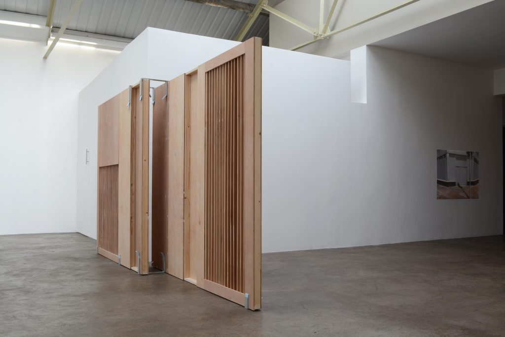
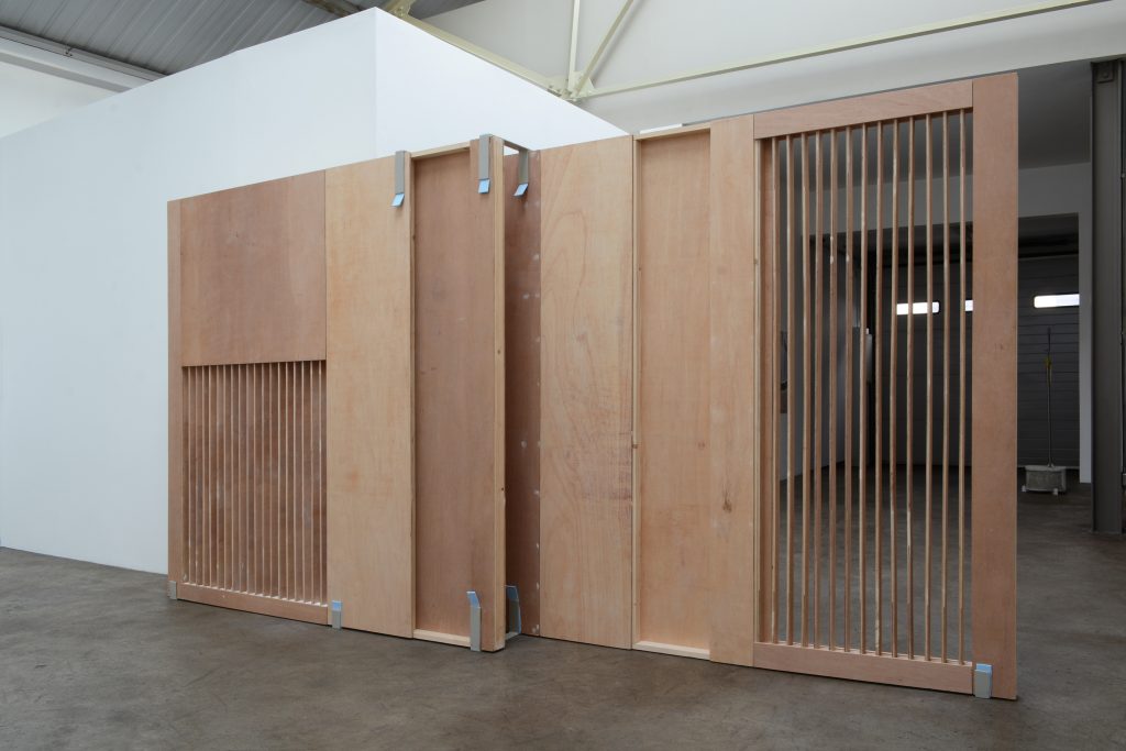
Áine McBride
Untitled (wall)
Plywood, timber, gesso, paint, welded mild steel fixings
173.5 x 321 x 31 cm (Two panels: 173.5 x 194.5 x 6.5 cm and 173.5 x 169 x 6.5 cm)
2018
Courtesy the artist and mother’s tankstation, Dublin | London
A few lines later she arrives via thickets of jungle, which then become a domesticated pot plant, to a Henri Rousseau painting – ‘a colonial-tropical fantasy’. At the end she compiles a list of connections or guesses about what these plants stand for:
Leaf of literacy
Leaf of evening
Leaf of poor copy
Leaf of feminism
Leaf of dialects
Leaf of imperialism
Leaf of the love I leave each morning … [2]
As a model for thinking through patterns in contemporary art yet-to-be historicised, ‘Botanical’ explores the tenuous links and incidental connections drawn out of associative thought.
The text was published in Starship, a Berlin-based art magazine with a post-internet aesthetic, influenced by internet culture and online graphics, its most recent issue (featuring Latimer’s work) pierced from cover to cover with a diamante stud earring. [3] The magazine’s editors describe Starship as ‘gravitat[ing] toward the German Zeitschrift, wherein the word Zeit (time) hints to the fact that it speaks out of and about a certain time, namely the one in which it is made’. [4] A night scene on the front cover shows a figure from behind stepping into a light blue taxi. The earring enters through the taxi’s rear window and exits through an ‘a’ in one of the contributors’ names listed on the back cover. Inside, low-res photographs taken at awkward angles and texts transferred from the realm of the private (e.g., an email to the editors from one Starship contributor, extracts from the diary of another [5]) emphasise the position of the individual and their handheld versions of the world. [6] The clear graphic form of the magazine creates a kind of seamlessness and evenness to the flow of content. Flipping quickly through it, I see: black-and-white ads, colour images of urban spaces, pavements, reflections in shop windows, blurred hands, people in coats passing by, traffic, pets in the streets, New York in 1979, a model looking into the camera in 1982, an unnamed Japanese city in 2017. The continuum of imagery reminds me of Roland Barthes’s description of journalistic photographs in Camera Lucida (1980), his book on the effects of photography on the viewer: ‘I glance through them, I don’t recall them, no detail ever interrupts my reading; I am interested in them (as I am interested in the world), I do not love them.’ [7] To describe the encounter with such images, Barthes proposes the concept of ‘studium’, a state of observation induced by images that are visually ‘interesting’ but that hold only a single, specific, easily inferable meaning for the viewer. His adjacent concept, the ‘punctum’, is the element that ruptures the encounter with an image. Pierce … puncture … punctum, the pages of Starship, literally ruptured by the earring, make me think of Barthes’s punctum, ‘that accident which pricks me (but also bruises me, is poignant to me)’. [8]
2
Once my eyes had adjusted from the sun, a small grey sculpture came into focus in the front gallery of mother’s tankstation. The work, titled c base (all works 2018), is constructed from concrete and linoleum, though only a tiny edge of lino is visible, sandwiched between two larger sections of concrete. Placed on the red-tiled floor, it is solid grey and 33.5 cm high. The general shape and surface appearance of c-base is similar to a small stack of breeze blocks, yet McBride’s sculpture, with its subtle curves and hollows, deviates from the uniform rectangularity of these concrete masonry units. What I thought was a neat pile of bricks is really a snaking configuration of brick-like forms. This misreading was reflected in McBride’s description of the sculptures in the exhibition press release: ‘They are an amalgamation of surfaces and often do not conform to one knowable form/shape (post-minimalist). A work shifts as it is circumnavigated.’ [9]
Áine McBride
t unit
Plywood, timber, tiles, tile adhesive, grout, jesmonite, mild steel, paint
145.5 x 175 x 123 cm (11 x 145 x 71.5 cm and 145.5 x 115 x 30 cm)
2018
Courtesy the artist and mother’s tankstation, Dublin | London
In the main gallery, there are five sculptures on the floor and two wo photographs, printed on perforated PVC and pinned to the walls. All of the works fit seamlessly into mother’s tankstation, a renovated industrial building – formerly a small sausage factor – which retains many of the architectural features of its past functions. McBride’s sculptures don’t look out of place surrounded by exposed metal beams, sections of wood panelling, polished concrete floor, and white walls cut into various shapes to fit around the uneven interior. The natural light is reflected on the subtle textures of these objects – concrete, metal, wood, and fabric – and illuminates their greys, yellows, roans, whites, and blues. A tall, flat sculpture made from wood, untitled (wall), interrupts the view from the entrance. One section is see-through, with lines of the wood cut away to form a grille. This, along with some of the other sculptures in the room, could be a half-formed item of furniture. In the background, a smaller and more furniture-like work in the same materials looks to have been constructed elegantly from a series of offcuts. The gallery press release describes this aspect of McBride’s sculptures: ‘Incorporating elements of flat-pack and modular furniture that for one-reason-or-another, have also become essential to our mobile lifestyles, her constructions and temporary or site-specific interventions, further reflect the constantly changing urban landscape of our cities, megalopolises and the way we navigate their infrastructures.’ [10]
Many contemporary artists are making work with building materials like those used by McBride – plywood, timber, tiles, jesmonite, mild steel, Formica, concrete – and while the use of such materials is certainly not new, the sculptural objects in work suite have a look that, I think, locates them visually in the time of their making: their Ziet. Immediately I began to draw a list of similar works, possible influences, and artists making work using industrial materials on a domestic scale. I thought of Latimer’s text and how she approaches the recurring motif of the plant; a feature of (some of) the art of this time. McBride’s works don’t feature plants or any other recognisably current motif. In fact, her sculptures feel unusual and wholly unique, even if the materials and some of the formal qualities seem stylistically contemporary. In McBride’s exhibition the sense of presentness is subtle and difficult to pin down. There are no quick links to 2018, no clear influence of internet culture. The sculptures aren’t easily categorizable, though the artist herself uses the term ‘post-minimalist’ and the press release mentions a series of other references: Philip Rawson, Donna Haraway, Michel de Certeau. Following Latimer’s lead, I charted a line of tangential associations that came to mind as a way of navigating the exhibition.
Áine McBride
Untitled (wall)
Plywood, timber, gesso, paint, welded mild steel fixings
173.5 x 321 x 31 cm (Two panels: 173.5 x 194.5 x 6.5 cm and 173.5 x 169 x 6.5 cm)
2018
Courtesy the artist and mother’s tankstation, Dublin | London
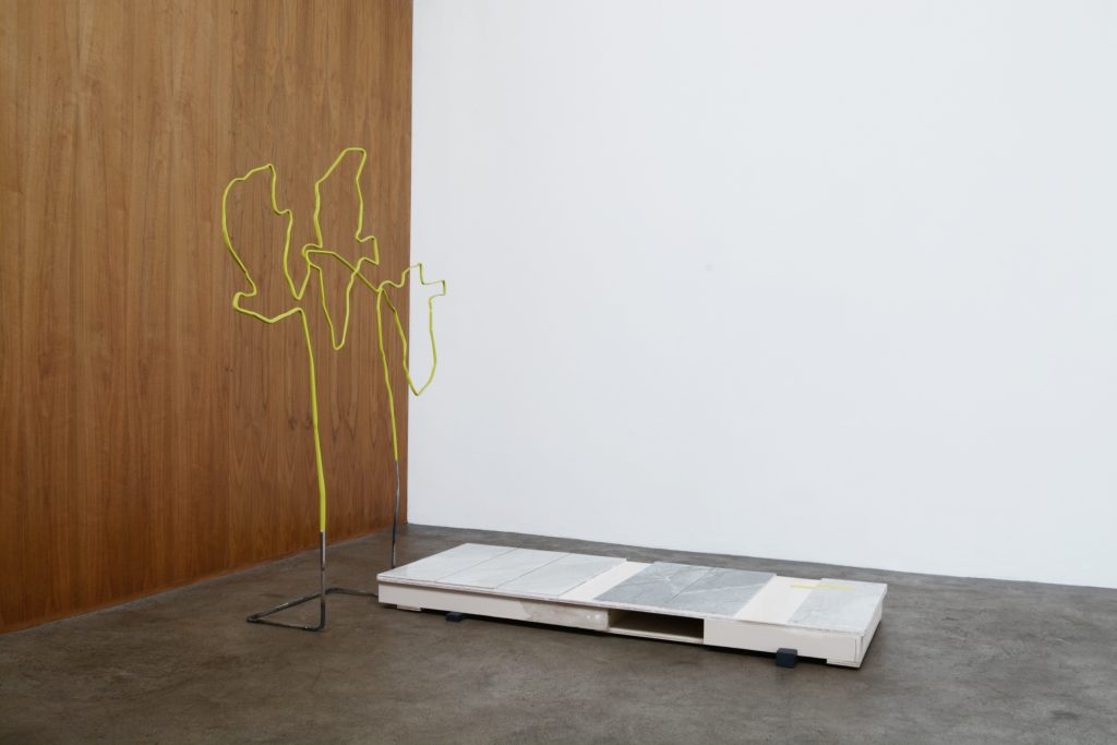
In the main gallery, I recognised a wall-mounted image from the artist’s Instagram account. An uncaptioned photo posted in May 2017 of a street corner and a boarded-up building painted over in light blue. A road sign in the foreground casts its shadow onto the concealed doorway. Here the image is printed onto microperforated PVC, a plastic often used for large outdoor advertising banners, fabric-like and punctured with tiny holes to allow the wind to blow through and the rain to run off, so that the message remains clear in spite of the weather. The opaque surfaces of the painted building, metal sign, and concrete path in the image are offset by the porous surface of the print. Through the material transformation of the printing process, the artist has drawn the digital image into the world of the other sculptures and in moving from screen to wall the colours have been muted. This image, untitled, faces b base, a thin wire sculpture with a concrete base that mirrors the height of the road sign in the photograph.
b base reminded me of Abraham Cruzvillegas’s work El Travieso (An Emotional Craft) (2012), also with an upright metal stem and, like McBride’s sculpture, a figure-like shape. There are strong formal similarities between both works although Cruzvillegas’s also includes meat, a small piece of check cloth, and a feather, while b base includes a length of lime green pleather and a solid base of concrete, unfired clay, and baby pink jesmonite. Clothing material – cotton and pleather – features around the ‘neck’ part of both works. Based on images of the Parisian Zazou and Californian zoot suiters, El Travieso is one of a series of sculptures using the ‘concept of garments or ways of wearing them as a political statement’. [11] The check-patterned swatch is drawn from images of zoot suits associated with the pachuco or pachuca subculture which originated in Los Angeles in the 1930s among young working-class men and women of Mexican origin, who developed the non-conformist style of dress as a reaction against both traditional Mexican and North American cultures. [12] El Travieso is inspired by a short story written by Cruzvillegas about a trumpet player, Miguel Prado, whose journey through self-destruction is interwoven with the sequence of changing musical and sartorial fashions. It explores how the different styles tied to ideologies of social equality and cultural identity faded as these movements failed – or inevitably ended in violence – and how new realities were sought. ‘Prado experiences and absorbs these movements, but feels displaced when the dress of one place is no longer relatable to another city or when a movement is no longer necessary.’ [13] In Prado’s story there is continuity between style and corporeal experience; a blurred distinction between body (interior) and clothing (exterior). Unike El Travieso, the pleather element in b-base is not explicitly tied to a particular narrative or sociopolitical reference, but because of its positioning and the artificial colouring, the metal, clay, and concrete components of the sculpture seem to be wearing the pleather like a necktie.
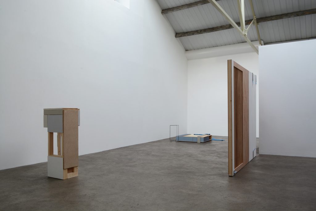
Áine McBride
work suite
Installation view
2018
Courtesy the artist and mother’s tankstation, Dublin | London
This is not the only work in McBride’s exhibition to reference clothing. Elsewhere, floor unit does so more explicitly: a bright blue shirt draped over a wooden square, the size and shape of a palette, connected to a waist-high cylinder outline in wire. The mercurial blue of the garment, lit by the sun from the overhead skylight, is the most intense colour in the room. Its style is utilitarian and difficult to attribute a date or a wearer to. Rounded seams and the synthetic sheen of the fabric make it seem more like a toile or mock-up than a finished item of clothing. Like the misread brick forms in c base, this object transforms from shirt to shirt-like object on closer inspection.
In a recent article for the Guardian, Jess Cartner-Morley uses the example of sleeves to point out the apparent slowness pervading trend cycles in the fashion industry. She demonstrates the rise of the five-year trend in fashion by the recurring popularity of the statement sleeve, a feature that has somehow managed to outlast the standard Spring/Summer Autumn/Winter refreshes. [14] From poet, virago, and bell sleeves to trumpet flares, sleeves, as Cartner-Morley outlines, are continuing to have a moment. She attributes this lag in turnaround in part to the prevalence of social media: ‘We still have high-speed fashion with a short turnaround – but we also have these slow-burning trends that shift very subtly, influenced by consumer lifestyle rather than fashion industry.’ [15] Mass dissemination of high fashion via social media channels has sped up the rate that trends can be taken up on the street and they now seem to be overlapping while control falls into the hands of the wearer. In work suite, DIY cultures, accelerated by the sharing possibilities of the internet, are reflected in the domestic-scale constructions and flat-pack appearance of the sculptures. McBride’s works seem to point to the ways in which we control and mediate the spaces we live and work in and reflect ‘the constantly changing urban landscape of our cities, megalopolises and the way we navigate their infrastructures’.
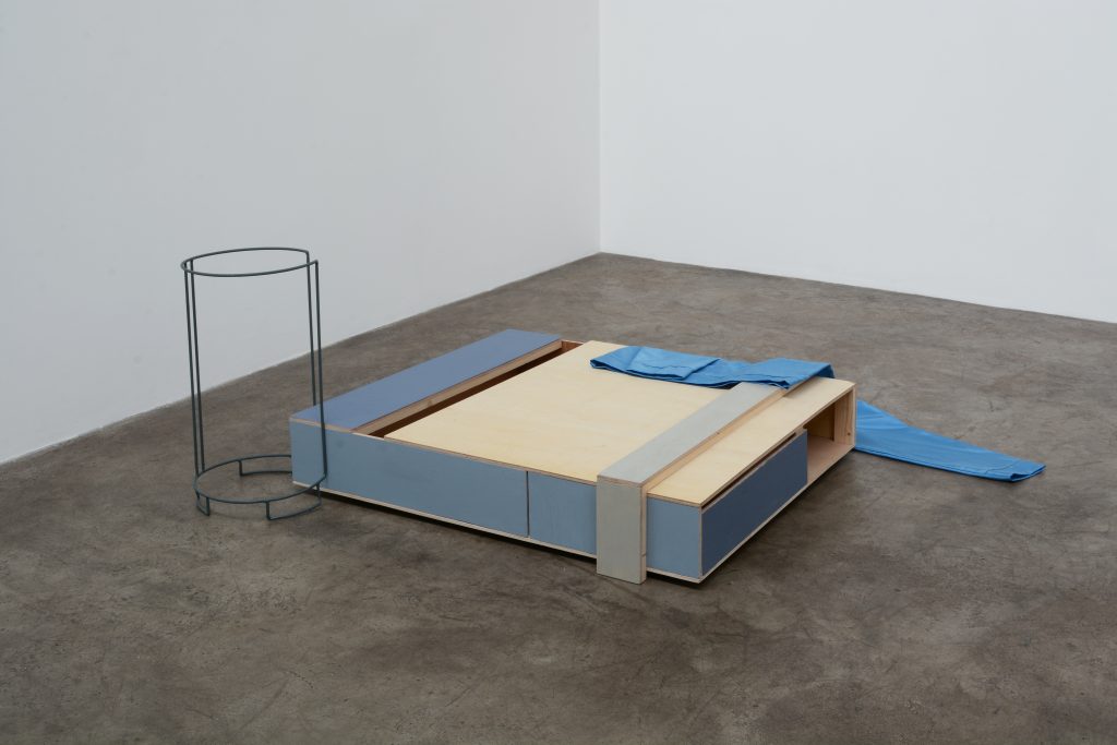
Áine McBride
floor unit
Plywood, timber, formica, paint, mild steel, fabric
53 x 156 x 146 cm (20 x 136 x 126 cm and 53 x 28.5 x 28.5 cm)
2018
Courtesy the artist and mother’s tankstation, Dublin | London
My encounter with the blue shirt in floor unit set in motion a certain logic for thinking about the exhibition. Its shifting presence in some kind of in-between state – a toile, a mock-up – changed my reading of the other sculptures in the room, and I began to see them too as possible maquettes: untreated wood, unfired clay, the pleather (a stand in?). Elaborating upon the concept of the punctum, Barthes wrote of its expansiveness: ‘However lightning-like it may be, the punctum has, more or less potentially, a power of expansion (…) while remaining a “detail”, it fills the whole picture.’ [16] While the sculptures in work suite feel complete and firmly rooted in the present, they also invoke a sense of futurity, in that I imagine they (will) continue. Thinking of maquettes, I imagine them as placeholders for a series of potential objects that will follow.
3
A few days before seeing work suite, I visited the National Gallery of Ireland with a friend, who stopped at a painting of two figures by the artist Jean-Baptiste-Siméon Chardin, The Young Schoolmistress (ca. 1735–36), to point out the teacher’s electric-blue dress sleeve. It looked freshly painted. Bright ultramarine fabric falls in neat folds from the tip of her shoulder and collects in darker blues at the table where she rests her elbow at a right angle to the viewer. In an otherwise muted (or time-faded) palette, this eighteenth-century sleeve is remarkable. It signals a discontinuity with the temporality of the painting and the artist’s lifetime. Chardin’s gift is capturing the weights of motionless objects: groupings of eggs, apples, glassware, copper pots, wine, garlic bulbs, meat, and fish – all typical of European still-life pictures at the time – have a sense of balance that is completely unique to his work, yet the distinction that draws me to them over others is so subtle as to be almost impossible to pin down.
Claire Walsh is a curator and writer based in Dublin. She is Assistant Curator (Collections) at the Irish Museum of Modern Art.
[1] Quinn Latimer, ‘Botanical’, Starship, no. 17, (Winter 2018): 63.
[2] Ibid.
[3] Starship was established in 1998 and is published by a group of Berlin-based artists and curators approximately twice a year. Each issue includes contributions from a group of regular writers in addition to issue-specific invitees. The earring on the cover of Starship, no. 17, is Park McArthur’s contribution (Studs, 2018), one thousand magazines pierced and bejewelled.
[4] See the website of Kunsthal Aarhus: http://kunsthalaarhus.dk/en/programmes/starship-magazine-starship-no-16, accessed 15 March 2018.
[5] Respectively: Park McArthur, ‘Some follow up questions’, Starship, no. 17, (Winter 2018): 3, and Scott Cameron Weaver ‘rare fragments from the notebook of an unspecified archetype’, Ibid: 116.
[6] This description of imagery and texts refers only to a selection of the content of Starship, no. 17, and, although not representative of all content, is intended to give a sense of the overall tone of the issue, as I experienced it.
[7] Roland Barthes, Camera Lucida: Reflections on Photography (New York: Hill & Wang, 1981), 41.
[8] Ibid.
[9] Press release for work suite, mother’s tankstation, 2018.
[10] Ibid.
[11] Abraham Cruzvillegas, quoted in Jenna Kagel, ‘At Regen Projects, Abraham Cruzvillegas Explores a Person, a Few Places and Many Things’, Southern California Public Radio, 7 November 2012, https://www.scpr.org/blogs/newmedia/2012/11/07/10858/abraham-cruzvillegas-explores-a-person-places/.
[12] They wore long jackets with wide lapels and padded shoulders, baggy trousers tapered sharply at the ankles, often with a chain dangling from the waist, and feathered fedora hats. Picture the outfit worn by Jim Carrey’s character in the 1994 film The Mask, which was appropriated from this style. These outlandish declarations of fashion challenged the dominant culture’s expectations and accepted racial behaviours which led to racially motivated violence by white U. S. soldiers in the 1943 Zoot Suit Riots.
[13] Cruzvillegas, in Kagel, ‘At Regen Projects’.
[14] Jess Cartner-Morley, ‘Déjà You? The Rise of the Five-Year Trend’, Guardian,10 March 2018, https://www.theguardian.com/fashion/2018/mar/10/statement-sleeves-midi-skirts-long-lasting-fashion-trends.
[15] Ibid.
[16] Barthes, Camera Lucida, 45.