‘The past working through the present will create the future.’[1]
Darby is from Antrim and had planned to incorporate the town’s civic heraldic shield and motto with that of Peters’ hometown, Banbridge. Laying claim to the emblems, the artists’ appropriated design was intended as a form of celebration of the democratic ‘ownership’ of lands once controlled by the gentry through royal decree.
The practice of bearing heraldry originated in the times of the Roman Empire through to the Middle Ages when soldiers bore a symbol as a means to designate which army they belonged and to honour their nation. King Edward IV prohibited the general use of personal crests and regulated their assignment to those families in his favour. Registration must still be sought for the incorporation of coats of arms to be used by borough councils. With the impending amalgamation of the Northern Irish Borough Councils in 2011, the artists had intended to document a part of their own history before it was lost on the graphic designers’ cutting room floor.
Before the opening of the exhibition the local council’s publicity department prohibited the use of the official civic crest – which placed the artists in a quandary – and asked the question: who does the council serve if not the people? Out of this, new work developed which explored the relationship between power and control. Despite the council’s censorship, the artists began fabricating their own autonomous version of the crest – thus creating a new coat of arms, specifically for the exhibition.
Mythical beasts such as the Minotaur and the Lamb with the Golden Fleece, along with a labyrinth, feature in their innovative adaptation. An accompanying motto, written in Latin, announces ‘vicis est iam’ translating as ‘The Time is Now!’ The motto originated from battle cries. The historical symbols with this phrase, declares, for the artists, that the ‘now’ is just as important as the past. It is a comment on those in power and their apparent obsession with conserving heritage whilst neglecting the issues of today. With this in mind, the present becomes obsolete and opportunities to make new ‘history’ are overlooked or quickly forgotten. Who chooses what historical facts should remain and stay memorable in a nation’s psyche?
In the work, the Minotaur, (a creature in Greek mythology, synonymous with underground darkness) is depicted as two inky black figures supporting and guarding the inner shield. On this inner shield the labyrinth is symbolised in a stylised pattern, and in the centre of this labyrinth sits the Lamb with the Golden Fleece. This heraldic motif is screen printed onto diverse materials such as wood-effect Formica, copper and brown paper. The creature’s presence is all pervading as it guards the corners of the gallery.
On a wooden pallet, there is a large selection of prints on brown paper. The prints are placed in a corner, thus inviting the visitor to take one. Perhaps they were deliberately placed here to test the attendant audiences’ attentiveness.
Sitting on an easel in another corner is an etching embedded into cheap, brown cardboard. The plaque imitates the commemorative plates used to identify places and events of significance. In the materials chosen, there is the presence of the valuable and the disposable, which questions the balance of power between the council and public; just as the copper plate relies upon the cardboard construction for support.
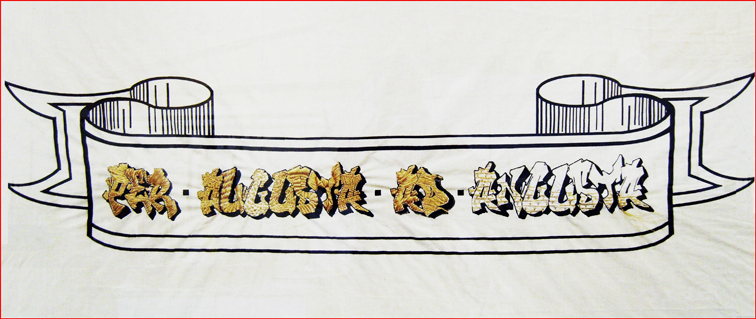
On a third easel, there is a large screen-printed insignia. The text and ribbon have been printed in monochrome on linen. The latin words ‘Per Augusta ad Augusta,’ (meaning: ‘Through Prosperity to Hardship’) are written in graffiti-style and embroidered with intricate golden thread embellishments. This phrase has been appropriated from the O’Neill family crest, but the artists have swapped around the second and last words thus creating a new meaning and giving the work a contemporary economic context; the golden thread, historically, being a symbol of aspirational wealth. This thread is contained in a graffiti font, which is usually associated with street art.
This graffiti font was chosen in response to the graffiti in the gatehouse, before its re-gentrification. In effect, the artists have purposively put the real possessors of power at centre stage.
Notes
[1]Alfred Douglas, The Tarot:The Origins, Meaning and Uses of the Cards(London: Penguin Books, 1974), 167.
Helen MaCormack is an art historian and freelance writer based in Edinburgh.


